Creating custom renderers
What is a renderer
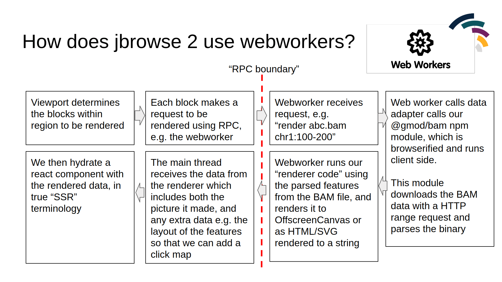
In JBrowse 1, a track type would directly call the data parser and do its own rendering. In JBrowse 2, data parsing and rendering is offloaded to a web worker via RPC, which keeps the main thread responsive.
You can make custom track types that do not use this workflow, but it is a built-in workflow that functions well for the core track types in JBrowse 2, and is recommended.
How to create a new renderer
A renderer is a class that implements a render function. It returns a React
component (the "rendering") along with any image data.
class MyRenderer implements ServerSideRendererType {
  render(props) {
    const { width, height, regions, features } = props
    const canvas = createCanvas(width, height)
    const ctx = canvas.getContext('2d')
    ctx.fillStyle = 'red'
    ctx.fillRect(0, 0, 100, 100)
    const imageData = createImageBitmap(canvas)
    return {
      reactElement: React.createElement(this.ReactComponent, { ...props }),
      imageData,
      height,
      width,
    }
  }
}
The above canvas operations use an OffscreenCanvas, which is supported in all
modern browsers.
What are the props passed to the renderer
The typical props that a renderer receives:
export interface PileupRenderProps {
  features: Map<string, Feature>
  layout: { addRect: (featureId, leftBp, rightBp, height) => number }
  config: AnyConfigurationModel
  regions: Region[]
  bpPerPx: number
  height: number
  width: number
  highResolutionScaling: number
}
The layout is available on BoxRendererType renderers so that it can layout things in pileup format, and has an addRect function to get the y-coordinate at which to render your data.
features is a Map of feature ID → feature. To iterate:
class MyRenderer extends ServerSideRendererType {
  render(props) {
    const { features, width, height } = props
    // iterate over the ES6 map of features
    for (const feature of features.values()) {
      // render each feature to canvas or output SVG
    }

    // alternatively
    const feats = Array.from(features.values())
    feats.forEach(feat => {})
  }
}
Adding custom props to the renderer
Track models themselves can extend this using their renderProps function.
For example, the WiggleTrack has code similar to this, which adds a scaleOpts
prop that gets passed to the renderer:
const model = types
  .compose(
    'WiggleTrack',
    blockBasedTrack,
    types.model({
      type: types.literal('WiggleTrack'),
    }),
  )
  .views(self => {
    const { renderProps: superRenderProps } = self
    return {
      renderProps() {
        return {
          ...superRenderProps(),
          scaleOpts: {
            domain: this.domain,
            stats: self.stats,
            autoscaleType: getConf(self, 'autoscale'),
            scaleType: getConf(self, 'scaleType'),
            inverted: getConf(self, 'inverted'),
          },
        }
      },
    }
  })
Rendering SVG
Our SVG renderer is an example, where it extends the existing built-in renderer type with a custom ReactComponent only:
export default class SVGPlugin extends Plugin {
  install(pluginManager: PluginManager) {
    pluginManager.addRendererType(
      () =>
        new BoxRendererType({
          name: 'SvgFeatureRenderer',
          ReactComponent: SvgFeatureRendererReactComponent,
          configSchema: svgFeatureRendererConfigSchema,
          pluginManager,
        }),
    )
  }
}
Then, we have our Rendering component just be plain React code. This is a highly simplified SVG renderer just to illustrate:
import { bpSpanPx } from '@jbrowse/core/util'

export default function SvgFeatureRendering(props) {
  const { width, config, features, regions, layout, bpPerPx } = props
  const region = regions[0]!

  const feats = Array.from(features.values())
  return (
    <svg>
      {feats.map(feature => {
        const height = readConfObject(config, 'height', { feature })
        // our layout determines at what y-coordinate to
        // plot our feature, given all the other features
        const top = layout.addRect(
          feature.id(),
          feature.get('start'),
          feature.get('end'),
          height,
        )
        const [left, right] = bpSpanPx(
          feature.get('start'),
          feature.get('end'),
          region,
          bpPerPx,
        )
        return <rect x={left} y={top} height={height} width={right - left} />
      })}
    </svg>
  )
}
The SVG renderer above shows you can use a simple React component with the
existing BoxRendererType without writing a full renderer class. Renderers
receive an array of regions; those handling only one at a time use regions[0].
Overriding the renderer's getFeatures method
Usually overriding getFeatures in your adapter is enough. If you need tighter
control over feature fetching, you can override getFeatures in the renderer
itself. The Hi-C renderer does this because it works with contact matrices
rather than conventional features:
import { toArray } from 'rxjs/operators'
class HicRenderer extends ServerSideRendererType {
  async getFeatures(args) {
    const { dataAdapter, regions } = args
    const features = await dataAdapter
      .getFeatures(regions[0])
      .pipe(toArray())
      .toPromise()
    return features
  }
}