Modifying JBrowse menus
Adding a top-level menu
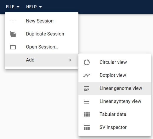
These are the menus that appear in the top bar of JBrowse Web and JBrowse
Desktop. By default, there are File, Add, Tools, and Help menus.
You can add your own menu, or you can add menu items or sub-menus to the existing menus and sub-menus. Sub-menus can be arbitrarily deep.
You add menus in the configure method of your plugin. Not all JBrowse products
will have top-level menus, though. JBrowse Web and JBrowse Desktop have them,
but something like JBrowse Linear View (which is an just a single view designed
to be embedded in another page) does not. This means you need to check whether
or not menus are supported using isAbstractMenuManager in the configure
method. This way the rest of the plugin will still work if there is not a menu.
Here's an example that adds an "Open My View" item to the Add menu.
import Plugin from '@jbrowse/core/Plugin'
import { isAbstractMenuManager } from '@jbrowse/core/util'
import InfoIcon from '@mui/icons-material/Info'

class MyPlugin extends Plugin {
  name = 'MyPlugin'

  install(pluginManager) {
    // install MyView here
  }

  configure(pluginManager) {
    if (isAbstractMenuManager(pluginManager.rootModel)) {
      pluginManager.rootModel.appendToMenu('Add', {
        label: 'Open My View',
        icon: InfoIcon,
        onClick: session => {
          session.addView('MyView', {})
        },
      })
    }
  }
}
Adding track menu items
If you create a custom track, you can populate the track menu items in it using
the trackMenuItems property in the track model. For example:
If you'd prefer to append your track menu items onto menu items available from
the base display, you can grab the trackMenuItems property from the extended
model and redefine trackMenuItems with your new Menu Item appended at the end,
like so:
types
  .model({
    // model
  })
  .views(self => {
    const { trackMenuItems: superTrackMenuItems } = self
    return {
      get trackMenuItems() {
        return [
          // calling superTrackMenuItems retains the menu items from the base
          // model
          ...superTrackMenuItems(),
          {
            label: 'Menu Item',
            icon: AddIcon,
            onClick: () => {},
          },
        ]
      },
    }
  })
Adding track context-menu items
When you right-click in a linear track, a context menu will appear if there are any menu items defined for it.
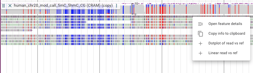
It's possible to add items to that menu, and you can also have different menu
items based on if the click was on a feature or not, and based on what feature
is clicked. This is done by extending the contextMenuItems view of the display
model. Here is an example:
class SomePlugin extends Plugin {
  name = 'SomePlugin'

  install(pluginManager) {
    pluginManager.addToExtensionPoint(
      'Core-extendPluggableElement',
      pluggableElement => {
        if (pluggableElement.name === 'LinearPileupDisplay') {
          const { stateModel } = pluggableElement
          const newStateModel = stateModel.extend(self => {
            const superContextMenuItems = self.contextMenuItems
            return {
              views: {
                contextMenuItems() {
                  const feature = self.contextMenuFeature
                  if (!feature) {
                    // we're not adding any menu items since the click was not
                    // on a feature
                    return superContextMenuItems()
                  }
                  return [
                    ...superContextMenuItems(),
                    {
                      label: 'Some menu item',
                      icon: SomeIcon,
                      onClick: () => {
                        // do some stuff
                      },
                    },
                  ]
                },
              },
            }
          })

          pluggableElement.stateModel = newStateModel
        }
        return pluggableElement
      },
    )
  }
}
MenuItems objects
You can add menus or add items to existing menus in several places.
In these different places, a MenuItem object defines the menu item's text,
icon, action, and other attributes.
Types of MenuItems:
- Normal: a standard menu item that performs an action when clicked
- Checkbox: a menu item that has a checkbox
- Radio: a menu item that has a radio button icon
- Divider: a horizontal line (not clickable) that can be used to visually divide menus
- SubHeader: text (not clickable) that can be used to visually label a section of a menu
- SubMenu: contains menu items, for making nested menus
| Name | Description |
|---|---|
| type | Options are 'normal', 'radio', 'checkbox', 'subMenu', 'subHeader', or 'divider'. If not provided, defaults to 'normal', unless a subMenu attribute is present, in which case it defaults to 'subMenu'. |
| label | The text for the menu item. Not applicable to 'divider', required for all others. |
| subLabel | Additional descriptive text for the menu item. Not applicable to 'divider' or 'subHeader', optional for all others. |
| icon | An icon for the menu item. Must be compatible with Material-UI's Icons. Not applicable to 'divider' or 'subHeader', optional for all others. |
| disabled | Whether or not the menu item is disabled (meaning grayed out and not clickable). Not applicable to 'divider' or 'subHeader', optional for all others. |
| checked | Whether or not the checkbox or radio button are selected. Only applicable to 'radio' and 'checkbox' |
| onClick | Callback of action to perform on click. Function signature is (session) => undefined. Required for 'normal', 'radio', and 'checkbox', not applicable to any others. |
| subMenu | An array of menu items. Applicable only to 'subMenu'. |
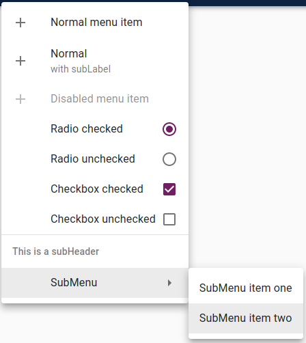
As an example, the here is an array of MenuItems and the resulting menu:
;[
  {
    label: 'Normal menu item',
    icon: AddIcon,
    onClick: () => {},
  },
  {
    label: 'Normal',
    subLabel: 'with subLabel',
    icon: AddIcon,
    onClick: () => {},
  },
  {
    label: 'Disabled menu item',
    disabled: true,
    icon: AddIcon,
    onClick: () => {},
  },
  {
    type: 'radio',
    label: 'Radio checked',
    checked: true,
    onClick: () => {},
  },
  {
    type: 'radio',
    label: 'Radio unchecked',
    checked: false,
    onClick: () => {},
  },
  {
    type: 'checkbox',
    label: 'Checkbox checked',
    checked: true,
    onClick: () => {},
  },
  {
    type: 'checkbox',
    label: 'Checkbox unchecked',
    checked: false,
    onClick: () => {},
  },
  { type: 'divider' },
  { type: 'subHeader', label: 'This is a subHeader' },
  {
    label: 'SubMenu',
    subMenu: [
      {
        label: 'SubMenu item one',
        onClick: () => {},
      },
      {
        label: 'SubMenu item two',
        onClick: () => {},
      },
    ],
  },
]